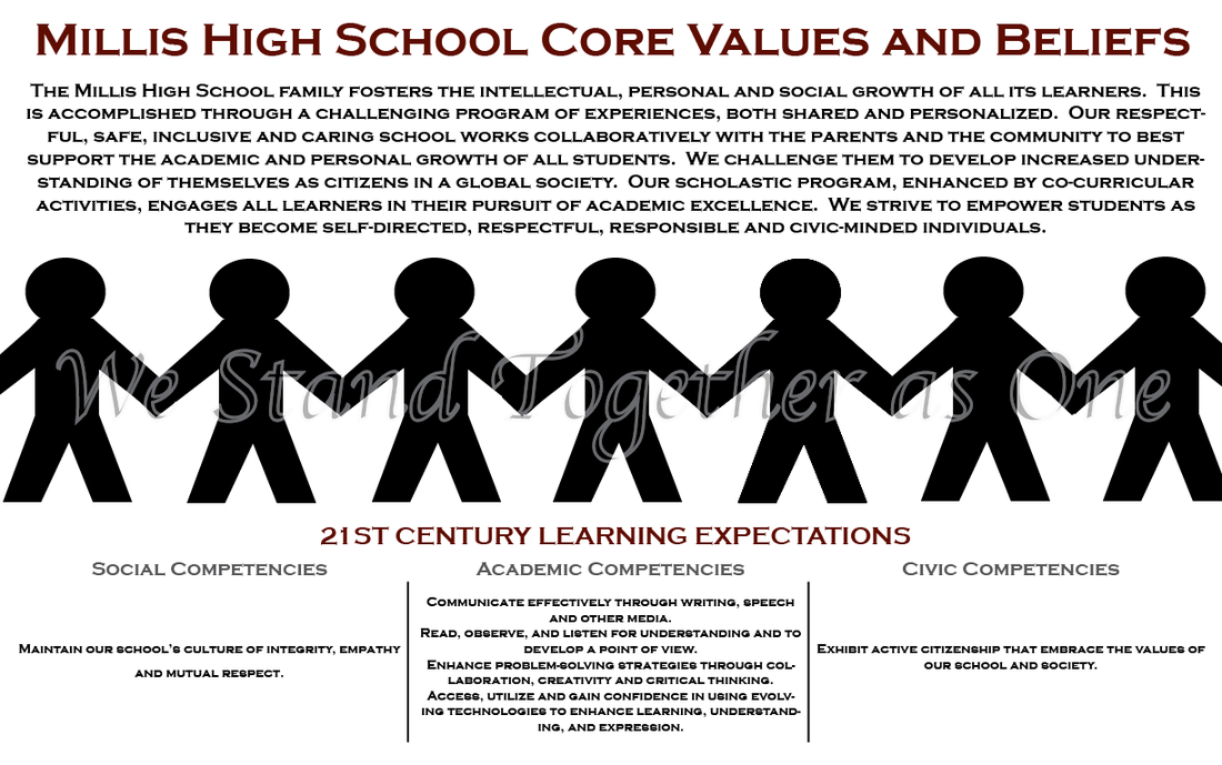
For my core values poster, I worked with Meredyth Catherine Curtis. We found a image off of google of a paper chain and then just used the pen tool to recreate it. Then, we just copy and pasted the words from itslearning. We decided that we needed a little something more so we wrote "We Stand Together as One," because we felt that it represented our school.
Realistic art represents actual objects and something that you might see in real life. For my realistic photo I put an effect on the original photo that made it look like an oil painting. The picture still looks like something that you would see in reality but it doesn't look like a photograph anymore. Abstract art takes a subject from reality and changes it into something that we aren't used to seeing. I posted two abstract photos because I couldn't pick one but they each have an effect on them that changes their color or shape. It makes them look different from what they normally are. Finally, non-objective art is nothing taken from reality; it is just something that is made up. I put a filter on my photo and zoomed in to create a non-objective piece of art. You can kind of make out some letters but other than that, it doesn't look like a "one way" sign. It just looks like a cool design.
Depth of field is the distance between the nearest and the furthest objects that give an image judged to be in focus in a camera and aperture relates to it because it controls which part of the image will be in focus. A lower aperture leads to less or a shallow depth of field and a higher aperture creates a deep depth of field. I didn't have a camera that actually controlled aperture settings but I did put it into the background defocus setting and used a blur tool in one of my iPhone apps to get the proper depth of field.
This is a picture from the 1930s when workers had to build skyscrapers and walked across beams thirty stories in the air.
For my yearbook, I wanted to do something kind of simple but also effective. I took a picture of the brick outside of our school and added text over it. Then, I made the Millis logo really big and a little bit transparent. I tilted it to the side a little so it looks as if it painted on the brick.
Art- This type of photography is mainly for entertainment. It often portrays something beautiful or pleasing to the eye. |
Photos Taken From Summer 2014 |